Final Exam
Required 1 What is the art criticism process?:
We start by laying our artwork out on our table and taking out a sheet of paper and labeling it as finished or in progress give it a title and add your own name, this is where the critiquing is done. Once this is done we get up and write 8 comments on other pieces of work. These comments must be a complete sentence of criticism. When writing these comments, you can chose to what to critique about the piece. If you are describing the piece, then you can list what you see in the artwork like what images do you see, which art elements you see, or describe the colors. When you analyze the artwork you try to use vocab words to sound like you know what your talking about. You can try to interpret the piece and explain what you understand from it and how it makes you feel. When you judge a piece, you can say how well they did on accomplishing there goal, like did they convey there message well or if we were working on adding value how well they did on shading. Then, one critique will be picked randomly and graded by the teacher.
We start by laying our artwork out on our table and taking out a sheet of paper and labeling it as finished or in progress give it a title and add your own name, this is where the critiquing is done. Once this is done we get up and write 8 comments on other pieces of work. These comments must be a complete sentence of criticism. When writing these comments, you can chose to what to critique about the piece. If you are describing the piece, then you can list what you see in the artwork like what images do you see, which art elements you see, or describe the colors. When you analyze the artwork you try to use vocab words to sound like you know what your talking about. You can try to interpret the piece and explain what you understand from it and how it makes you feel. When you judge a piece, you can say how well they did on accomplishing there goal, like did they convey there message well or if we were working on adding value how well they did on shading. Then, one critique will be picked randomly and graded by the teacher.
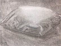
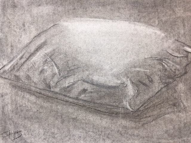
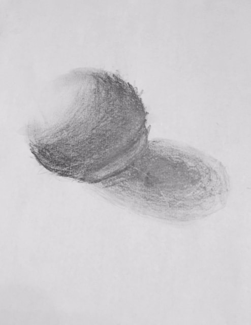
This piece is a pillow using charcoal as my medium. I started with charcoal evenly all over the paper then defined the edges with a charcoal pencil. After this I added the folds and all the value. I believe adding value was my best part of this work so it was a success. I chose charcoal because it always gives me a relaxed feeling which is what i wanted to feel when people saw this pillow. This pillow arrt piece was very successful i believe it look realistic and makes me feel the way i do when i want to be relaxed with a pillow.
Picked 1: 18: What was the warm up or sketchbook assignment that you learned the most from? In had to be a combination of all the facials features because from these i had no idea where to start. I had always just drawn basic circle eyes and curved mouth. Now i know what they really should look like along with the proportions. These help me a lot in my normal drawing and especially in my portrait piece.
Picked 2: 9: Illustration Fridays have been completed almost every week this semester, do you feel this assignment helped you brainstorm for main project or helped you skill levels in any way? Why, or why not
Illustration Friday helped me develop brainstorming skills. I was able to create a whole piece with even just one word. Sometimes if i was drawing on my own before this class i would just sit and wait and do nothing waiting for inspiration to hit me but from doing so many of these I'm able to get inspiration form even little things. I don't think this helped me to brainstorm for main projects but it did develop my basic drawing skills.
Illustration Friday helped me develop brainstorming skills. I was able to create a whole piece with even just one word. Sometimes if i was drawing on my own before this class i would just sit and wait and do nothing waiting for inspiration to hit me but from doing so many of these I'm able to get inspiration form even little things. I don't think this helped me to brainstorm for main projects but it did develop my basic drawing skills.
Picked 3: 7: What is the point of this class? What did you get out of it?-I think that the point of this class is to show students how to better their artistic abilities, and to encourage them to explore further and expose them to the art world. Art 1 is a base that opens up the possibility of classes like to expand in other art fields. I got many things out of this class, but the most prominent would have to be how to look for inspiration thanks to illustration Friday and inspired artist. Before this class I drew mostly just from my head but now i learn to draw from seeing things and from real world.
Paper Name
Mixed Media
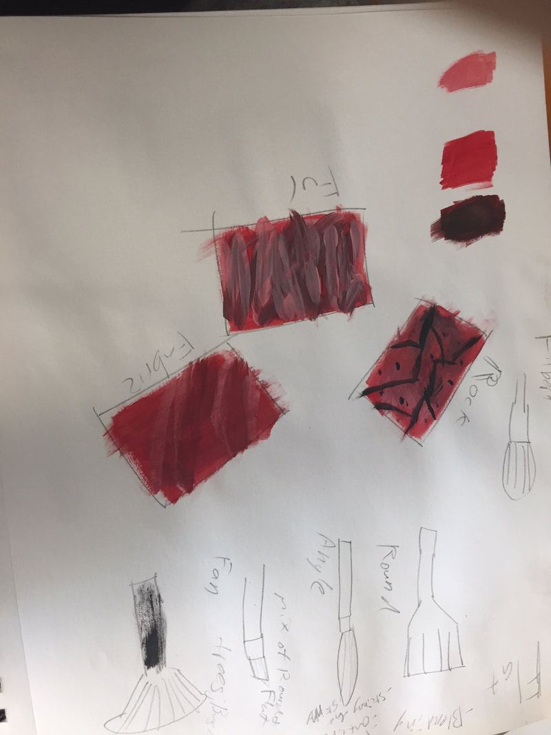
My first layer is watercolor with the blue background color that I liked. the second medium is tissue paper I put tissue paper on and used Modge Podge made a shape with it. Then for the rectangle I made the shape with tissue paper and tape as my third medium to properly make a shape. I then used construction paper and glued it onto the art piece as a pentagon. and finally for my last medium I used charcoal for a hexagon.
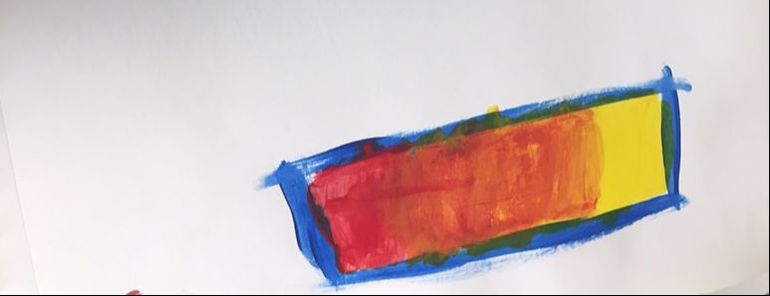
My prompt was Fill a blank page with shape. Paint or fill them in. I portrayed it by making some shapes with various mediums.
My prompt was Fill a blank page with shape. Paint or fill them in. I portrayed it by making some shapes with various mediums.
Watercolor
I used 1 point perspective. I took this picture by my friends house in Chapel Hill. The sky was the hardest because I couldn't ever keep consistent color. Most everything was difficult for this project I was not very good at it but keeping consistent lines was probably the hardest. The perspective warm-up where we draw the hallway helped the most because it helped me grasp the whole perspective thing and the line work warm-up also helped a lot because I had never help a watercolor brush or done anything with one so it help me get see what I would be like to paint with one.
Portrait
I did a portrait of my friend Ian Simpson. My dad grew up with his parents and so no were family friends. I used the pencil and paper medium.
For this portrait I started with the eyes because we just learned them in class then I made the shape of the head by using the proportions from class. I then gave him his headband then hair. Then I just worked down the facial features from there until i finished then shade in the face.
If I were to do this over again i would spend more time working on the ears because they came out the worst or I could just practice them a couple more times. I think the hair and nose came out as well as I could expect them to so that is what I'm most happy with.
Portrait Warm-Up
The Warm-Up that is helping me the most is definitely the nose Warm-Up. This is because my nose has always just been the a triangle hanging of the edge and even a little help brought me a long way.
The most surprising the about the proportions is definitely the 1/3 eye, nose, mouth ratio.
The most surprising the about the proportions is definitely the 1/3 eye, nose, mouth ratio.
Linocut Printmaking
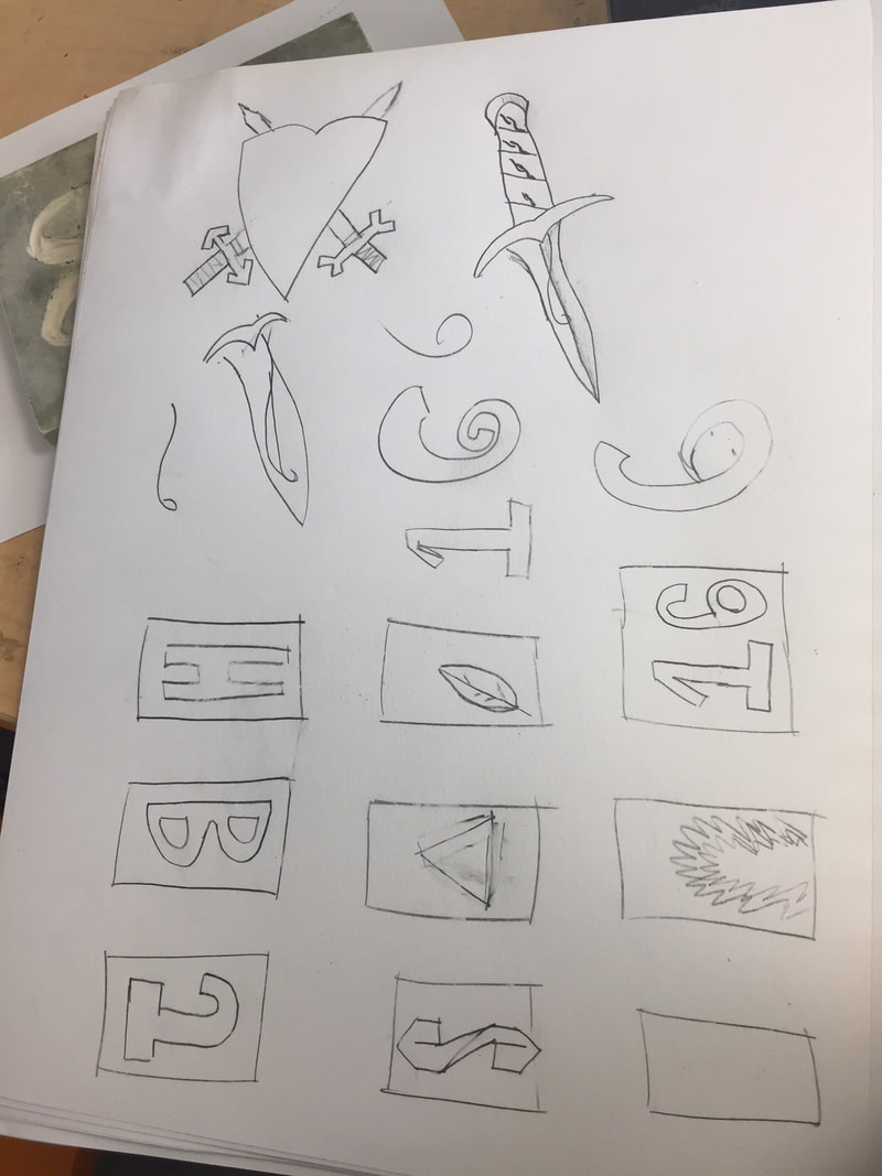
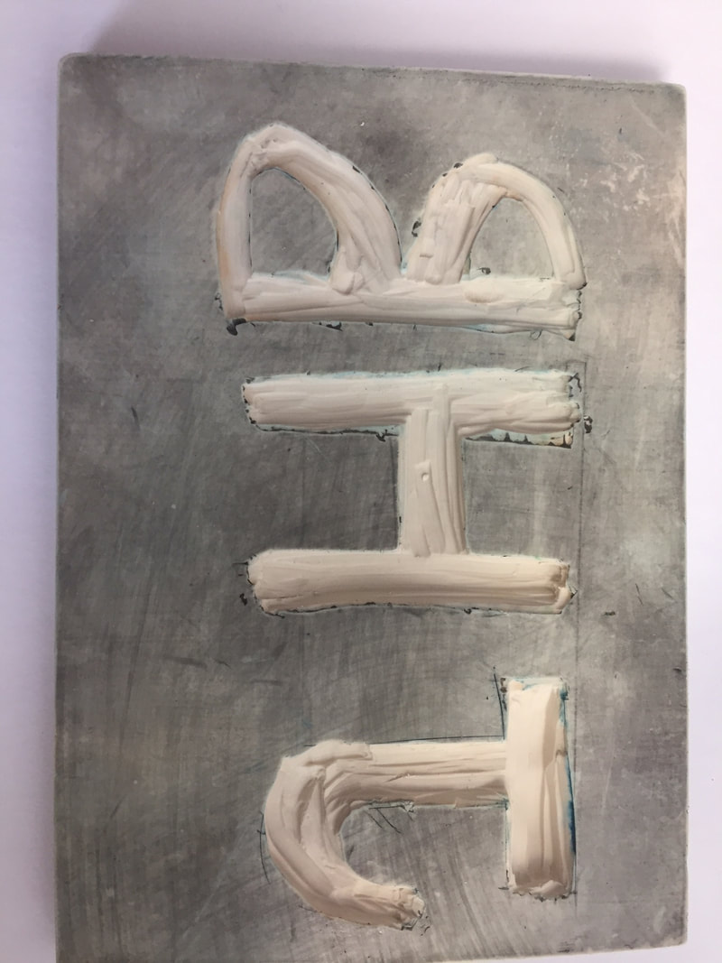
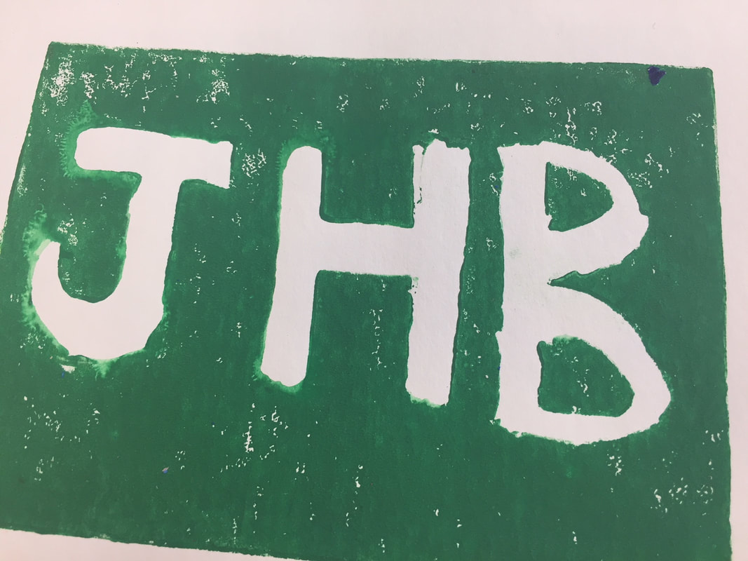
My Stamp shows off "line" theme because I only use basic lines to create my linocut stamp. My piece is successful because I wanted to have my Initials clearly laid out and that happened. If I were to do it again I would add more depth and shading to the piece. This would make it look more realistic and professional.
Clay Project (In-Progress)
To finish my clay project I will smooth out the top. Then i will add holes to the main body. After that I will glaze then fire then add glaze if needed then do my final glaze and it will be done. So far getting the right sized clay slab to roll is the hardest part. Getting the base shape and top have been easy so far. As of now i have rolled out the slab into a cylinder. Scored and slipped the bottom circle to the main cylinder body. Now it is green ware.
Clay Project (Finished)
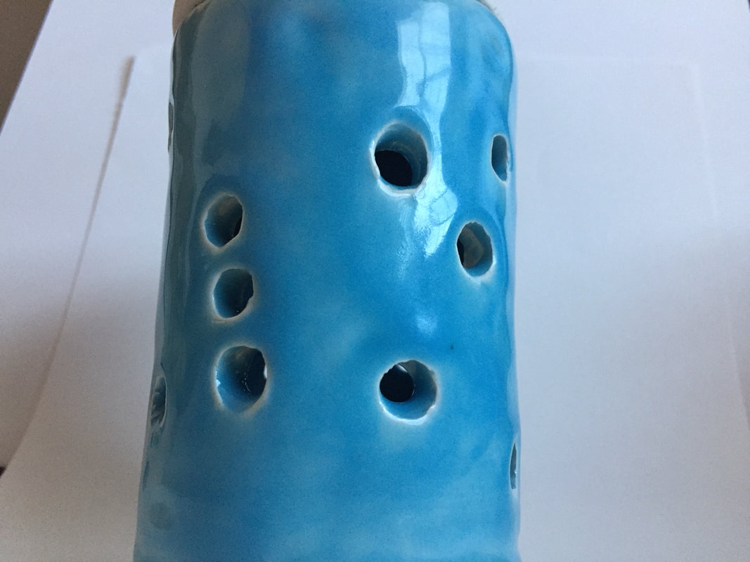
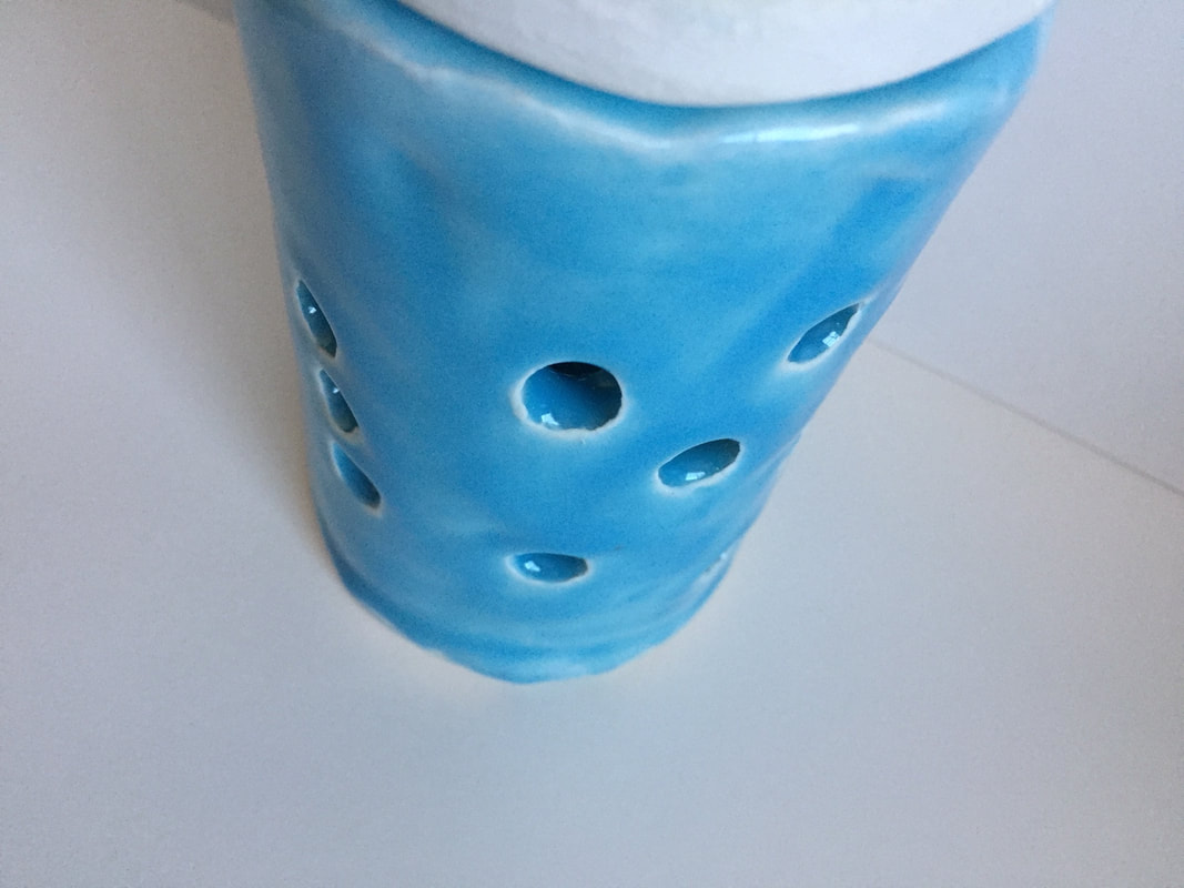
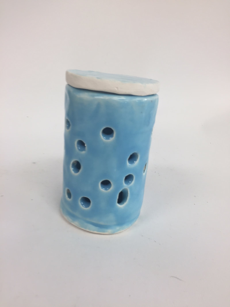
Since the in-progress i used a drill bit to drill in holes and smoothed out some edges. I then glazed the piece then fired it and touched up any less glazed spots then fired it once more and now its finished. It was a success because I created a lid that worked properly with the cylinder box. If I were to do it again I would have spaced out the holes more and used a bigger drill bit.
Learning Color
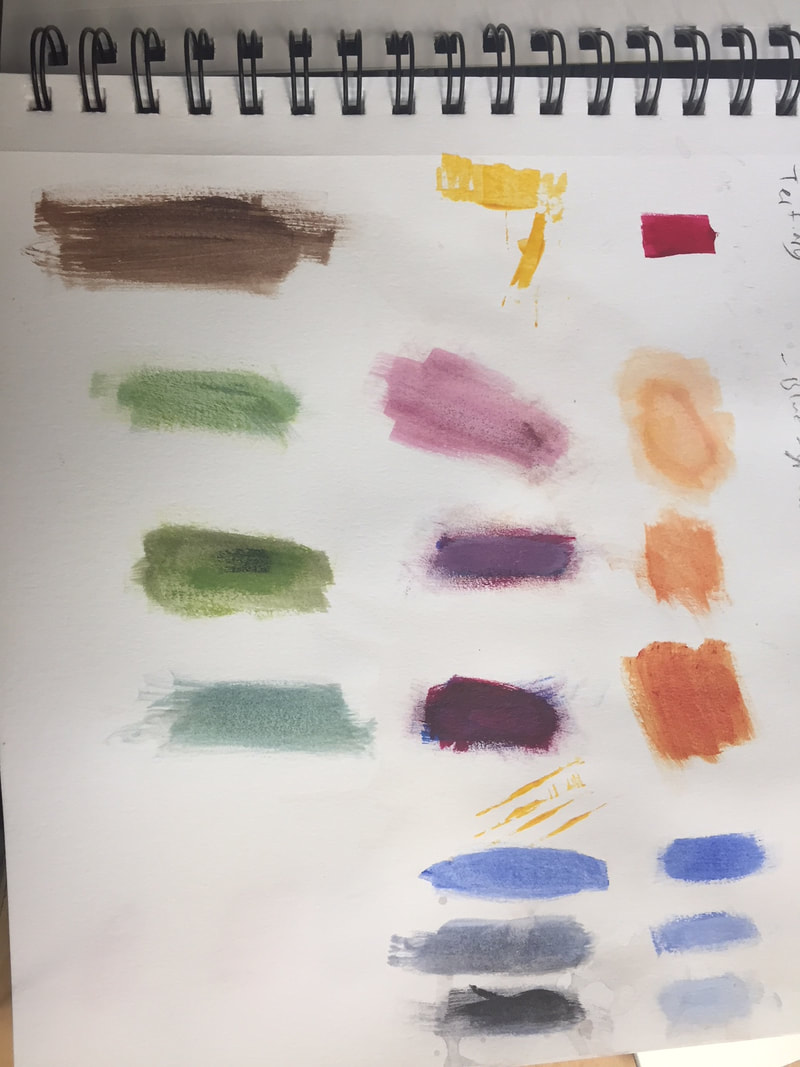
I learned that using darker colors and mixing them with the base tone gives a darker shade to the base color. Also, adding a lighter color to the base color gives a lighter shade of the color.
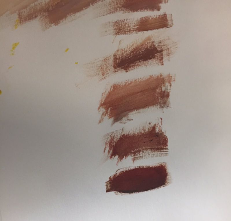
We had to mix colors like red and Yellow to make brown then added colors like black to make it darker. Also, we used other colors to test if it would make it lighter or darker.
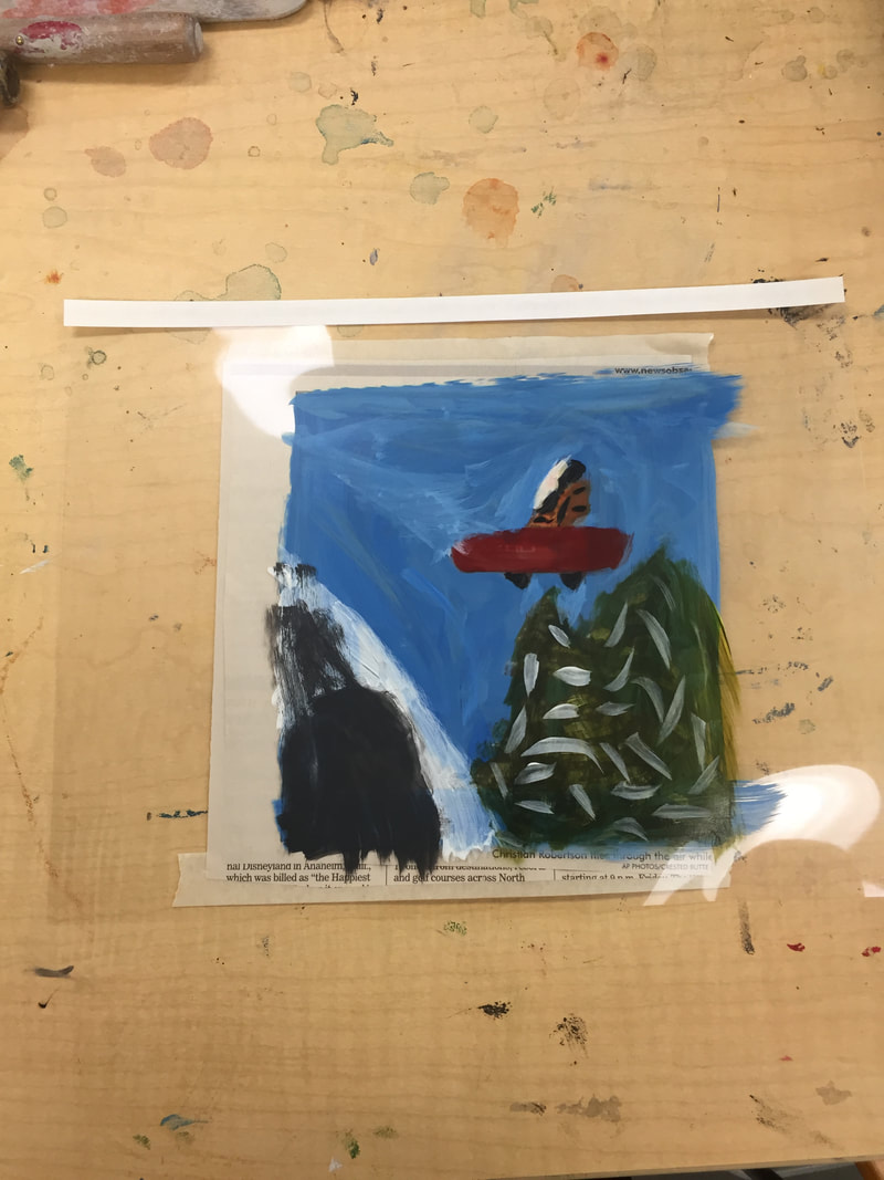
We took a picture then placed a transparency over it and painted on the transparent sheet to match the colors and use the color mixing techniques we just learned.
The Idea of Place

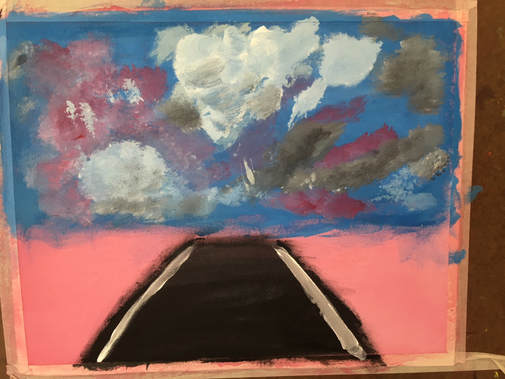
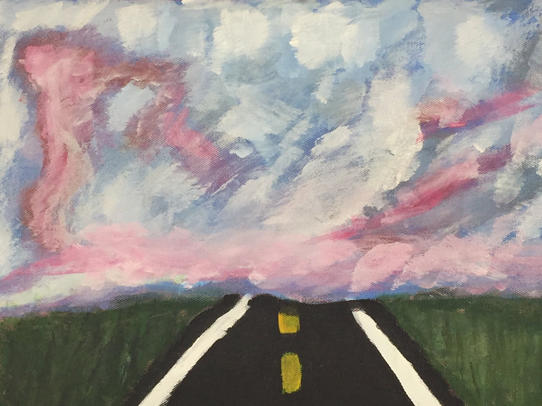
Every year my family gets in the car and drives a the way to Utah and last time we drove there I saw a very beautiful sunset and took out my camera and took a picture of it. The hardest part to draw was the coloring in the clouds because its hard to incorporate red and orange with the other colors of the sky. The road was the most successful because it was easy and pretty straight forward. I started with the horizon line and created spots where the most colors were in the background that i could paint over to add depth. Then worked on the road and grass when the clouds were drying.
Intro to Drawing Project 1
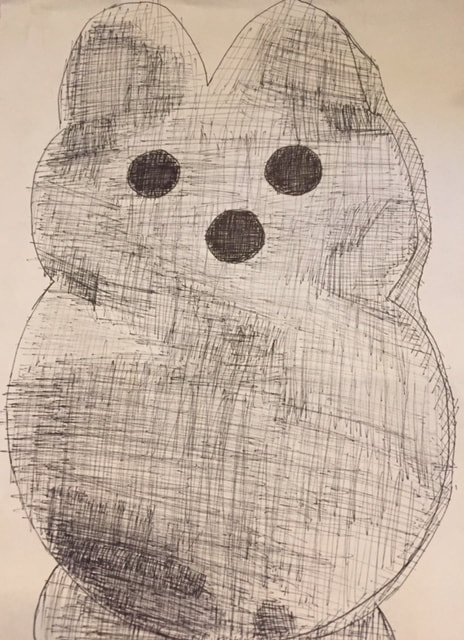
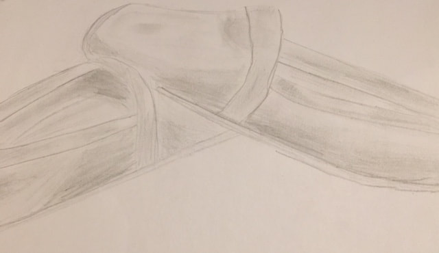
For my drawing theme I chose comfort. I drew a basic pillow in charcoal, my sisters peep pillow in pen, and my slippers in pencil.
My most helpful warm up was drawing the sphere because I didn't know how to add value and depth.
Value: The lightness or darkness of a color.
Composition: The placement of objects in a piece of art.
Composition: The placement of objects in a piece of art.
Pros:
Pencil: Easy to create value
Charcoal: Mistakes can be covered up, easy to blend,
Pen: Clear defined lines, darker
Cons:
Pencil: Must be sharpened regularly
Charcoal: Messy, Smudges easily
Pen: No erasing, hard to shade
Pencil: Easy to create value
Charcoal: Mistakes can be covered up, easy to blend,
Pen: Clear defined lines, darker
Cons:
Pencil: Must be sharpened regularly
Charcoal: Messy, Smudges easily
Pen: No erasing, hard to shade
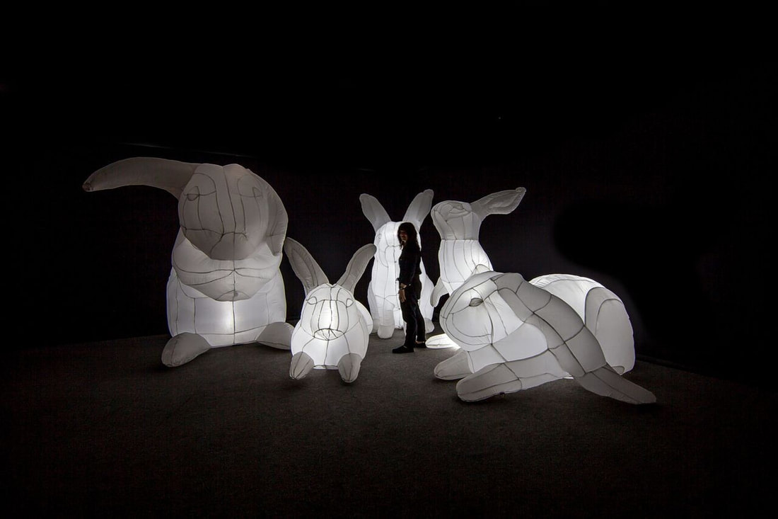
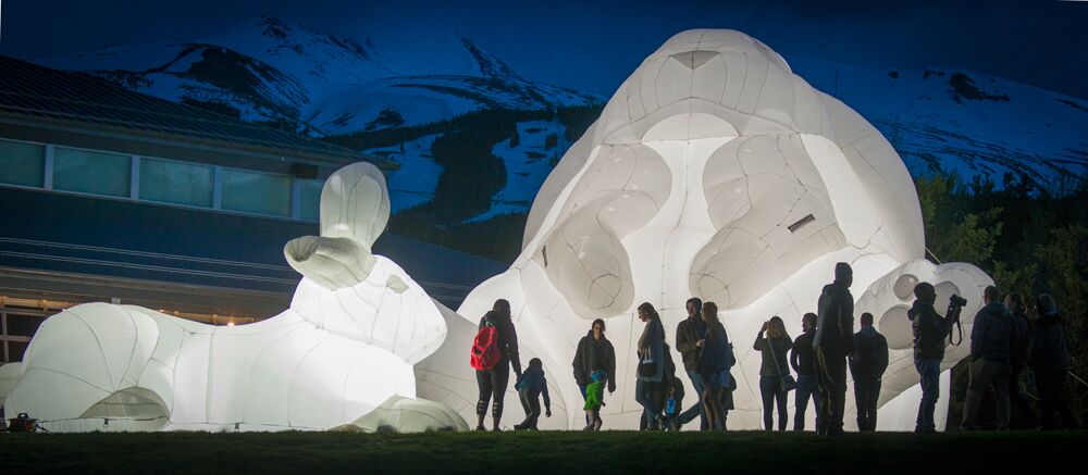
Inspired Artist
The artist that inspired me the most was Amanda Parer, (https://www.parerstudio.com/). Amanda makes large light-up inflatable animals mostly rabbits. In Tasmania where she lives and works, rabbits are viewed as invasive and not cuddly like they are her tin America. Her use of wire and white fabrics shape the rabbits. During the bright hours of the day they appear opaque , but when the darkness of the night falls they light up from within to shed light all around, she has named this project intrude. They appear very "huggable" and are made in all shaped and sizes. I like her work because it is not able to be viewed in a museum like most art and her rabbits vary from a few feet tall to over 20 feet tall.